Upon commencing my Master of Science in Applied Psychology in late 2021, my curiosity led me to look at the players within this evolving landscape. I am a designer by trade so I did what I do best and this meant for me to get at it with a comprehensive visualization of some of the brands within the psychedelic ecosystem.
This year, I got curious again as to who else is in the media space within psychedelics, what colours are prominent, and how media presents itself visually online.
Please note, the colours give an overview. If you know of any psychedelic publications that I have not included–do let me know!
With gratitude, Alexandra 🍄
Today:
A Closer Look at Psychedelic Media Brands
“The Art of Authentic Expression in Branding” keynote by Jemma Campbell, Head of Creative US, Moving Brands speaking at the Psychedelics Design Online Event on April 11
A Closer Look at Psychedelic Media Brands
The role of media in shaping psychedelic narratives is significant, influencing public perception and attitudes towards psychedelics. New psychedelic news outlets have been emerging to counterbalance mainstream media narratives, providing diverse perspectives and in-depth coverage of psychedelic culture and industry.
“Overall it creates an information ecosystem that matches — if not exceeds — all the action and news in the psychedelic space, and creates huge opportunities for psychedelic-focused journalists, publishers, and readers.” – Reilly Capps for MAPS
Media plays a crucial role in shaping psychedelic narratives by framing discussions, influencing public opinion, and contributing to the overall discourse on psychedelics. The significance of branding in establishing a media presence is crucial as it is for any business.
Branding plays a vital role in defining a company's values, mission, and overall experience offered to the audience, especially in the digital realm where competition is fierce. A strong brand presence not only helps in reaching a wider audience but also allows businesses to communicate their narrative, differentiate themselves from competitors, and build credibility online.
Today, we see everything from 'funky' typesetting, slightly overloaded icons, images and symbols, minimalist, to classic magazine style and a range of icons which will appear on websites and “across marketing paraphernalia”. Sometimes adding to the story, but occasionally adding confusion or seeming to simply hang out with the name of the brand - a bit like a third wheel.
The classic psychedelic aesthetic is vibrant colours, potentially rainbow (but make it candy-coloured), intricate shapes, and symbolic imagery, it is wild and free, creating a visual experience rooted in the exploration of altered states of consciousness.
Colour influences our emotions profoundly, with a single colour having a series of meanings and interpretations to various people in various cultures globally. In a previous interview, Bruno Maag, founder of Dalton Maag (now retired) mentioned for example that "with the spectrum of colours, you also run into functional issues; for example, a light yellow or green makes foreground and background colour contrast weak, which means that many people wouldn't be able to access it if presented on a white background. The visual acuity of a 60-year-old is only 20% of that of a 20-year-old, and that is the natural age-related deterioration." Designers think of such things.
Current Psychedelic Media Ecosystem
Much like the overall psychedelic ecosystem 2 years ago, the growing psychedelic media ecosystem today is equally leaning towards the trust conveying darker blue hues and–with view exceptions–shades of purple.
There is still much uniformity, both in logo design as well as website design. However, there has been a clear development happening over the past months especially, where brands become much simpler in their branding, the typography less funky, with added readability and clarity. Interestingly we see about half of all psychedelic media outlets (us included) having their logos now in the neutral colours black and white.
Media on the Web
Ambiguity is the enemy of accessibility. The more clear and concise, the easier it is for the brain to decode the individual shapes and the easier it is to extract the meaning.
Reading and writing are some of the most complex and involved activities a human can do, requiring a large number of resources from the brain, yet we take it all for granted. Bruno Maag wrote about the visual system illustrating the many places where things can go wrong, resulting in access to written information being impaired or denied altogether.
In an online environment, you also have all the technical accessibility issues, like how the typeface renders on screen. Has it been prepared and engineered to render well on various screens? Ensuring that the chosen colour palette meets accessibility standards is equally essential. Designers need to consider colour contrast ratios to enhance readability and inclusivity.
Not only that, balancing current design trends with creating a timeless website design can be challenging. While trendy colours may initially attract attention, they can quickly become outdated, affecting the website's longevity. Designers need to strike a balance between staying current and ensuring the design remains relevant over time.
Again, similar to when first looking at the psychedelic space, the colours of the websites are trusting shades of blue and purple.
Many brands within the healthcare and psychedelic industries strategically incorporate the colours blue and violet due to the specific psychological associations and symbolism linked to these hues. Blue, renowned for its calming and trustworthy qualities, is frequently selected to evoke reassurance and stability, particularly in environments associated with mental health and well-being.
This enduring preference for blue in healthcare and pharmaceutical branding is rooted in its connotations of trustworthiness, dependability, and tranquillity. The colour purple, on the other hand, ties to magic, mystery, and independence. If you look at it that way, violet serves as a symbolic bridge between the tangible and the transcendental, inviting individuals to go on profound inner voyages of self-discovery and growth with openness.
It is interesting to note that it looks like, at least from a visual POV, that some media brands such as Psychedelic Spotlight, Mycopreneur, Psychedelics Today, Shroomboom (mix of media and shop), and Psytelligence have outgrown their infancy and adapted their looks to appeal to a more general audience, giving them a stepping stone to discovery and supporting the shift of narrative by looking similar to classic media publications.
Brands evolving
Some logo transformations:
Psychedelics Today: A well-established media player, offering “industry-leading education for a community of over 2.2 million annual learners, Psychedelics Today has the largest global reach of any media platform in the modern psychedelic realm.” In addition to its content, the company offers a range of courses.
Women On Psychedelics: A platform with a focus to “empower and connect women worldwide on their journeys of self-discovery and healing.” Additionally offering “safe and supportive spaces for women to bravely explore the mindful use of psychedelics without judgment.”
Psychedelic Spotlight: The publication offers “the latest stories in the emerging psychedelics industry, covering breakthrough discoveries, investor news and cultural reform.”
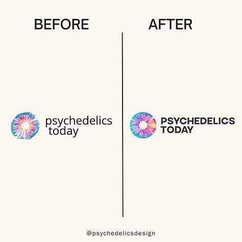
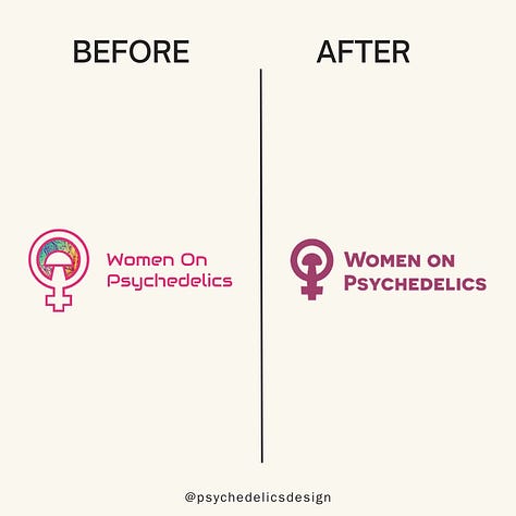
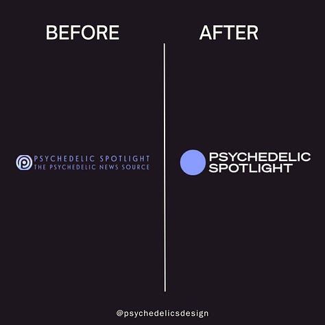
❤️ I have the honour to be a contributing writer to all 3 of them.
The Art of Authentic Expression in Branding
Jemma Campbell will be speaking at the first Psychedelics Design Conference on April 11th, 2024. The conference is online only and attendees will have access to recordings.
With a rich portfolio spanning major projects for global giants like GM, Microsoft, and Mastercard, Jemma specializes in crafting impactful brand identities and fostering deep connections with audiences.
Key Takeaways:
• The principles of branding
• Authentic storytelling
• A case study in branding
• Designing the future
FROM OUR PARTNERS
Blossom - Helping You Understand Psychedelic Research
Blossom offers weekly insights backed by an insightful and evergreen database of all things related to psychedelics as medicines. The platform makes the troves of hidden data visible through detailed and easily searchable information on psychedelic papers, companies, key people, news, events, and more databases. Next to the individual databases, Blossom combines disparate psychedelic landscape pieces in detailed reports.
Whats More?
Floris Wolswijk, Founder of Blossom and FLO Coaching, will be giving you an insider's overview of the current psychedelic landscape and future directions of the research and general emerging ecosystem.
Unfold Trip Kits
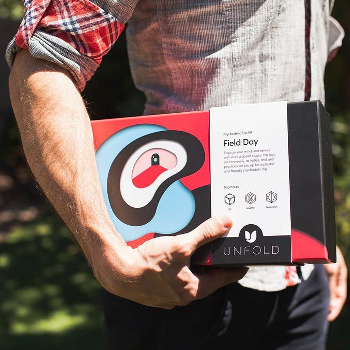
Unfold “think of designing an experience as creating a work of art” and we at Psychedelics Design could not agree more. Their trip kits are physical packages containing curated objects, activities, and guidance. No drugs are included. Each kit is themed according to your environment, who you’re tripping with, and intentions such as connection, exploration, and growth.


